CASE STUDY 01 - MOBILE APP
Pregnancy
Tracker
A subscription-free pregnancy app featuring day-by-day guidance, social milestone sharing, and a local specialist finder — designed to reduce the stress of pregnancy.
Note: This product has not yet been released.
It is currently under development.
UX DESIGN
UI
PROTOTYPING
VISUAL DESIGN
UX RESEARCH


ROLES
DELIVERABLES
TOOLS
Lead Product Designer
Researcher
Visual Designer
Wireframes
Visual Designs
Interactive Prototypes
UX Research & Analysis
Figma
Adobe Creative Suite
Claude Design
OVERVIEW
A pregnancy app built around
communication, guidance and finding experts.
PregTracker improved on pregnancy apps like Flo by adding what competitors overlooked: robust communication features and local resources. I am leading the design of a subscription-free tracker to keep family and friends informed while helping users find nearby Ob/Gyns, hospitals and classes.
PROBLEMS & SOLUTIONS

Problems
— How do we make the journey of preganancy
easier to manage?
— How do we organize vast scheduling and
health information into a digestible experience?
— How do we notify family and friends about
milestones in a timely, personal way?
— How do we make finding local specialists
faster and easier?

Solutions
— Day-by-day guidance with context-sensitive
tips and articles that adapt across trimesters,
plus health stat tracking.
— Provide a smart scheduling tool and hub for
the expectant mother.
— Smart notifications to friends and family
via text messaging, similar to Uber's ride
status updates.
— Specialist finder: search by distance, filter by
insurance accepted, book or call directly — all in
a few taps!

INFORMATION ARCHITECTURE
Flow diagram
Before mocking up PregTracker, I mapped the information architecture for the app. This helped the Dev team understand the total screen count and how data would flow between them.

IA - Flow Diagram
PRELIMINARY DESIGNS
Wireframes
Created in Figma, this diagram maps Maps key interactions to screens throughout the app — establishing the navigational logic before moving into visual design.

Wireframe Explorations
DESIGN ITERATIONS
Color palette evolution
Screen designs went through several rounds of revisions based on user feedback. The palette moved
from green to pink, with larger buttons for easier interaction.
Five users found the green treatment too clinical.
Four users preferred the pink UI as more welcoming and playful.


V1 - Green Palette

V2 - Pink Palette (Selected)
FINAL DESIGNS
Key screens



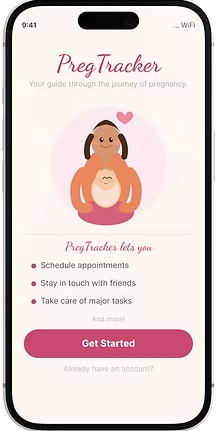
Welcome


Checklists

Tell Friends


Track Your Weight


Account Setup


Calendar

Maps


View Diet
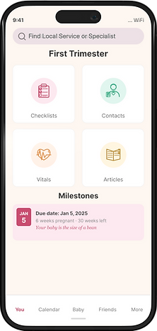
Home

Contacts


Inline Ads

Log Your Meals
Early map designs


Final map design

The screen shows what health insurance the specialist accepts.
User not only sees specialists in their area, they can also book appointments right from the app.
Maps Detail
USER TESTING
Methods and findings
Six women — either mothers or newly expectant — participated in testing. All had used a smartphone
for at least three years. Sessions used interactive prototypes and focused on onboarding, core
journeys, and features unique to PregTracker.

Key findings from usability testing
NEXT STEPS
To do list
Maps
The locator map fills a critical gap in pregnancy apps. While users found it intuitive, it was built rapidly and doesn't fully match the app's visual language. Better integration would create a more polished, cohesive experience.
Messaging
Designed for high contrast readability. Next phase: reskin with colors that better match the app's pink palette and Lottie animation style.
Ad-tech
Testing has supported the hypothesis that visual ads integrated into the feed outperform text-based and pop-up formats.
We'll run a multivariate test to confirm before committing to a revenue strategy.
Community & feedback
Forums and mentoring are planned for a future version, along with in-app feedback on articles to assess editorial content quality and relevance.