top of page

Problems
-
Visa's OpCerts servers would reject thousands of credit card stat spreadsheets from banks each quarter due to user input errors.
-
These rejections caused delays for issuing new shipments of Visa cards to banks around the world.
-
Due to these rejections, Visa didn't know how much to charge banks for distributing their cards.
-
This meant that Visa could lose up to 4 billion dollars in revenue each year.
-
-
-
The data entry learning curve was high.
-
Technicians were also required to file quarterly reports on card distribution, but had no idea how to do this.
Solutions
-
Use one definitive spreadsheet system for data entry that would look the same to every user.
-
For spreadsheet input errors, use dialog boxes to help users quickly enter right answer.
-
In addition provide support docs available for download.
-
-
Show data entry technicians what step they are on in the process.
-
Show how much data entry has been completed.
-
Show how much data entry is left to go.
-
-
Provide Visa Card Quarterly reports automatically, once all data has been submitted, instead of assembling by hand.
My Roles
-
Product Designer
-
Visual Designer
-
Interaction Designer
Deliverables
-
Wireframes
-
Visual Designs
Tools
-
Figma
-
Zeplin
The Finished Product
Below is the finished solution for OpCerts. It uses a Dashboard and Progess Bar to unify different components. Previously Data Entry Technicians had trouble finding different components to get their work done.

Research
What is OpCerts?
OpCerts is a system used by Visa, to track how many Visa credit cards (products) have been distributed by banks around the world.
Visa receives this information each quarter.
Visa uses it to determine:
- How many cards to give a bank the subsequent quarter.
- How much to charge banks for the cards.
Thousands of banks participate in this service.
The system was rife with errors from data entry technicians.
There was no help to fix these errors. Once uploaded to Visa, thousands of these erroneous reports from banks were rejected.
If these errors and rejections were not fixed, Visa stood to lose 4 billion dollars per year in payments.
How are OpCerts Forms Organized?
Visa has over a hundred OpCerts credit card product forms that banks can send to them.
These forms live under six ( 6 ) credit card family product names including:
1. Credit 4. Acquiring
2. Debit 5. Other
3. Prepaid 6. Associates

Image: OpCerts Data Structure
Confusing Spreadsheets Submitted by Banks to Visa.
One of the most difficult parts of the upload process in OpCerts was that there was no standardization.
Rather than using one form to upload data, many different forms were used by banks.
This led to confusion among Technicians.
In addition the OpCerts system rejected many of these forms due to formatting issues.
If we could use just one form with the correct fields in place, perhaps we could reduce rejection by OpCerts.


Image: Different forms lead to confusion.
User Interview Takeaways
Our team interviewed 7 Data Entry Technicians from banks around the country that file OpCerts data every quarter.
The majority of pain was around entering data.
Users found data entry very confusing.
In addition, they were told there were eight ( 8 ) steps, they needed to complete for filing. Typically though, technicians were only able to complete three.


Image: Initial user feedback - Complaints
Objectives and Key Results
Our interviews uncovered two key groups: Business Management and Data Entry Technicians.
Here are features we chose to implement to improve their journey.

Business OKRs
-
Let Business users view OpCerts reports easily.
-
Display information better.
-
Get quarterly reports on card stats for bank.

Data Entry OKRs
-
Make the OpCerts system easier to use for input.
-
Show what step I'm on and what's left to do.
-
Improve acceptance rates for our submitted forms to Visa
-
Help us create quarterly reports for Business team.
-
Give us Online Help.
Personas: Martin, a Data Entry Technician
After conducting interviews at banks I crafted a number of personas.
Our team referred to personas throughout the design process.
They helped our stakeholders keep their eyes on who we were designing for.
Personas helped our team answer questions like:
"Is this how Martin would enter data for these reports?

Image: Martin - An OpCerts Data Entry Tech
Ideation
Brainstorming
Thanks to interviews and additional research into the data entry process, our pod developed a deep empathy for Data Entry Technicians on the front lines.
We realized, that not only were the eight steps of data entry complicated, they were also located in different, hard to find places. We made efforts to unify the experience, reduce clutter, and improve the user's understanding of the process.

Image: Brainstorming on Whiteboards

Image: Card Sorting Exercise / Figjam
Interaction Design
Explorations: How to File in an 8 Step Process
Users were required to follow 8 steps to file OpCert stats correctly to Visa.
(See below)
1. Verify data
2. Log changes
3. Answer questions
4. Update contact info
These steps could be organized in a number of different ways.
At first we thought of a single dialog box.
This dialog box would change features as needed for each step.
For example, answering Visa Card questions would bring up one set of fields, uploading data would display yet another.
In order to understand the data entry steps better, we explored using a wizard as well.
5. Upload OpCerts files
6. Validate information
7. Review
8. Submit data
Testing Flow Models - Dialog Vs. Wizard
We did more testing with two data entry models:
1. The single dialog box, is more compact than a wizard, but doesn't
help user understand where they are in overall process.
2. A wizard that would follow you every step of the way.
In the end, the Wizard was the winning design for 5 out of 7 test subjects.

Image: Wizard Wireframe
Preliminary System Flow Diagram
Our brainstorming sessions helped break the OpCerts process into different modules.
These would serve to guide our team as we nailed down specifics of the UI.

Image: OpCerts Original Process Diagram
Revised System Flow Diagram
After in depth analysis of the product, we imagined a more streamlined flow for the system. Our first step to reducing confusion for Data Entry Technicians, was to leverage a wizard style UI,
using a progress bar at the top.

Image: OpCerts Proposed Process Diagram
Pain Point - Uploading Data
The most difficult part of the OpCerts process for users was filling out and uploading data.
The user had six credit card product categories to upload data for namely:
Credit
Debit
Prepaid
Each of these categories had dozens of forms a technician might need to fill out.
Each of these forms were prone to input errors.
The error messages to Data Entry Techs were confusing providing no help on how to fix them.
.
This meant forms could not be completed and submitted to Visa, grinding the process to a halt.
Acquiring
Other
Associates
Testing: How to Show Data Entry Completeness?
During interviews, we learned that Data Entry Techs didn't know when they'd completed filling out and uploading forms for a Visa product line.
If Techs could tell when they'd completed a section, perhaps we could reduce the abandonment rate.
In turn, more completed forms would get submitted to Visa.
We explored different ways to indicate that a process was complete.
We looked at: bar graphs, dials, fuel gauges and other models.
Below are some examples from this study.


Image: Different Ways to Illustrate Completed Tasks
Testing Visual Representation
We gathered seven users for a quick test on information visualization.
I asked them the following question:
"Which of these images best shows how much of a task is done?
If you don't like any of the images, please feel free to sketch out your own."
Five out of seven users chose the donut chart.


Image: Widgets to Show Completion
Image: The Winner for Info Viz - The Donut Chart
Wireframes
We started building out wireframes for key screens including: File Input and Uploads.

Image: OpCerts Wireframes
Mockups
Dashboard Callouts

Image: Completed Design with Annotations
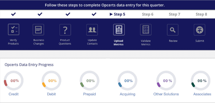
What Step am I On?
We designed a progress bar, to show technicians their location in the data entry flow.
Below this progress bar, the system would display the relevant screen for each given step.
Step 5 - "Upload Metrics," is the data entry step for technicians.

Image: Steps in OpCerts
A New Way to Enter OpCerts Form Data
Drilling down to forms
In this example, we're on step 5 of the process - The data entry step.
To access forms, users click on the Donut Chart for a given credit card family.
In this example, let's click on, "Prepaid."
Note: Donut chart indicates that Prepaid data entry is 27% complete.

Image: Click on Prepaid Donut
Mega-menu with all forms Prepaid's family
Clicking on, the "Prepaid," donut, spawns a Mega-Menu.
The menu shows links to all data entry forms for the Prepaid Credit Card family.

Image: Mega Menu with Prepaid Infinite Debit Report Selected
To the left of each form name in the Mega-Menu, is a status icon, (See below).
In this case, the status icon shows, there are errors for the data entry form, "Prepaid Infinite Debit."
Click on this link and the form for Prepaid Infinite Debit will appear.
From Mega-Menu to Data Entry Form
We're now on the form for Prepaid Infinite Debit.
The Red section shows links to each data entry error on the form.
User clicks on the first link.
As a result, user goes to the first error field in pink.
Technician then clicks in the pink error field.

Image: Error on Data Entry Form
Fixing Errors: Context Sensitive Help
Clicking on the pink error field spawns a Help dialog box.
This popup explains how to fix the error by including a range of expected values for that field.
User updates the value in the field based on instructions from the Help popup.
The technician keeps selecting pink fields with Online Help till the entire form is corrected.
The user clicks, "Save," and completes the form.

Image: Context Sensitive Help Dialog Box
Generate Quarterly Reports
Once the technician has corrected all errors in their forms, and submitted them,
they see a screen that summarizes the fees their bank is expected to pay to Visa.
User can either:
- Upload all of their OpCerts forms data, ("Certify Now")
- Create a report for Business users.

Image: OpCerts Fees
Generate Reports for Management Team
This report is autogenerated for Business users in the OpCerts process.
Instead of taking Data Entry Technicians days to gather this data,
the new system could generate it in seconds.

Image: Reports
Design System
Here is an excerpt from the design system built for this project.
Image: Generate reports screen

Image: Design System
User Testing
Test Results
Usability testing was conducted with 9 Data Entry Technicians from banks around the country.

Progress Bar
In general, users found the progress bar vastly improved their idea of where they
were in the data entry system.
Favorable Reviews: 9/9
Donut Charts
Favorable Reviews: 7/9
Most users found the representation of progress, easy to understand.
Two users had some issues with viewing the Mega-Menu.

Mega-Menu
Favorable Reviews: 7/9
Most subjects found the Mega-Menu easy to understand and navigate.

Forms + Context sensitive Help
Favorable Reviews: 6/9
In general, users liked the new error checking feature and Context Sensitive Help.
Some users needed about thirty seconds to understand the interaction.

Objectives and Key Results Revisited
OKRs Addressed
At the end of our project, we were able to provide the following benefits to users in the OpCerts process:

Business User Needs Met:
-
Modernized look and feel for OpCerts
- View Reports
- Business users could now view quarterly reports automatically.

Data Entry Technician Needs Met:
Wayfinding
-
The progress bar shows data entry technicians where they're going and where they've been.
Users were no longer lost in the OpCerts process.
Data Entry
- Donut Charts + access to forms made data entry easier.
-
Improved debugging with pink fields and Inline Help for forms.
Success Rates
-
Higher Successful Submission Rates to Visa.
-
Acceptance rates rose from 65% to 92% for forms.
-
The Bottom Line
Not only did our team enable Visa to retain its $4 Billion line of revenue,
we made the system much easier for Data Entry Technicians and Business to use.
Next Steps
More Intuitive Drilldown
While most users liked the ability to drill down to reports, one or two had trouble with it. This could be remedied by a better call to action above the Donut chart such as, "Click to see forms."
As an interim fix, we emailed each user with instructions on how to access forms and fix errors.
It's possible however, that a more comprehensive change to the UI should be tested as well.
Mobile Designs
The OpCerts process lives primarily on the desktop. Future builds might use a mobile footprint as well. However, the kind of data entry work required for the app, makes a mobile build less likely.
Additional Feedback
The team will continue to gather feedback to see where we can make more comprehensive improvements in version 1.1.
Thank You
Copyright © 2025 - Joe Wahrhaftig, All rights reserved
bottom of page