← Portfolio / Case Studies / Microsoft Video on Demand
CASE STUDY 05 - CONSUMER PRODUCT
Microsoft Video on Demand
Designing a Netflix-meets-IMDB streaming experience for the Microsoft Surface Tablet and widescreen TV — built on Microsoft's Fluent Design Language for the AT&T U-Verse Media Hub.
INTERACTION DESIGN
10 FT UI
MULTI-PLATFORM
WIREFRAMES
FIGMA
ROLE
UX Designer
CLIENT
Microsoft UX Division
TOOLS
PLATFORM
Figma, Adobe Illustrator
Surface Tablet + TV
FINAL DESIGN

01 — BACKGROUND
Netflix discover meets Amazon X-Ray
Working within Microsoft's UX Division, I was brought in to design a video on demand service for the Surface Tablet — part of the AT&T U-Verse Media Hub. The concept sat at the intersection of streaming and metadata: users could browse and download content for offline playback, while also diving deep into IMDB-style cast and production information, much like Amazon X-Ray. The service had to work seamlessly across two very different viewing contexts: a handheld Surface tablet and a 10-foot widescreen TV.
THE CONCEPT
Stream + discover
Download shows for offline viewing, with IMDB-style cast and production details surfaced contextually — like Amazon X-Ray, but for the Microsoft ecosystem.
THE PLATFORM
AT&T U-Vverse Hub
The service was built as part of AT&T's U-Verse Media Hub — a partnership between Microsoft and AT&T to deliver a premium media experience across Microsoft hardware.
THE CONSTRAINT
3 taps to any content
A hard navigation constraint drove the entire IA: users had to be able to reach any piece of content in three taps or fewer, on both tablet and TV.
02 — THE MULTI-PLATFORM CHALLENGE
Designing for two very different distances
Designing for a Surface Tablet and a 10-foot TV screen simultaneously is a genuinely complex constraint. The "10FT UI" concept — standard in TV interface design — means every element must be legible, tappable, and navigable from across a room, using a remote rather than a finger. Typography, touch targets, navigation depth, and content density all had to be rethought for each context.

03 — DESIGN PROCESS
From whiteboard to formal flows
The process began with collaborative whiteboard brainstorming sessions to map user paths through the application. Once the key flows were agreed on, I formalized the architecture in detailed site maps and wireframes before moving to high-fidelity mockups.

Initial IA Sketches of Media Hub

Formalized IA Diagram for VOD
04 — KEY INTERACTIONS
Spotlight and tap-and-hold
Two interaction patterns defined the core experience: the Spotlight screen — a command hub for search, recordings, and featured content — and the tap-and-hold gesture that revealed rich episode metadata without requiring a separate screen navigation.
SPOTLIGHT + CHARMS
The command center
The Spotlight screen let users set up recordings, search for programming, and explore featured stories. Charms — a Windows 8 Metro pattern — slid in from the right edge to provide contextual actions without disrupting the main view.
RECORDING VIEW
Tap-and-hold metadata
In the recordings view, tapping and holding on any episode tile revealed a contextual overlay showing metadata: episode summary, cast, runtime, and options to play or remove from the collection — without leaving the grid.

Spotlight with Charms on the edge

Tap-and-hold to see metadata
05 — SEARCH EXPERIENCE
From keyword to episode summary
The search flow was one of the most complex user journeys to design — progressively narrowing from a broad keyword all the way down to an individual episode summary, with filtering and sorting controls at each level. Below is the full flow using "Dare" as an example search query.

06 — FINAL MOCKUPS
Fluent Design brought to life
After whiteboard sessions and flow approval, I produced high-fidelity mockups for each key screen — built to Microsoft's Fluent Design Language specifications and reviewed against the 3-tap navigation constraint at every stage.

Landing Screen — Recordings

Episode Guide
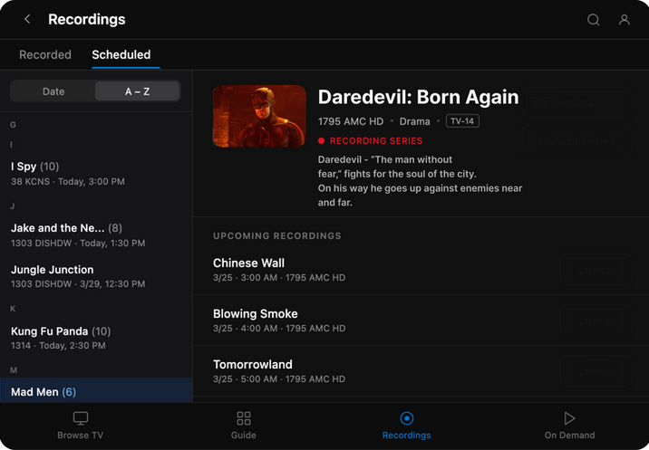
Recording Schedule
07 — REFLECTION
This project pushed me into design territory I hadn't fully explored before — multi-platform thinking at the intersection of lean-back and lean-forward experiences. A few key takeaways:
01
Distance changes everything
The 10FT UI constraint forced a rethinking of nearly every design decision — type size, touch targets, navigation depth, and content density. What works on a handheld screen can be completely unusable from across a room.
02
Constraints clarify
The "3 taps to any content" rule was a forcing function that made IA decisions easier, not harder. When a design violates the constraint, you know something needs to be restructured — there's no ambiguity.
03
Design systems earn their value on multi-platform work
Working within Microsoft's Fluent Design Language meant many foundational decisions were already made — freeing focus for the interaction and navigation problems that were genuinely novel to this product.
Thank you
Microsoft Video on Demand Case Study
© 2026 Joe Wahrhaftig. All rights reserved.