
Overview

Citrix and Bytemobile released a service that could run a deep dive into mobile phone networks. The system could provide information about: peak usage, the number of users on a network, the most popular phones, and more.
The primary customer base was executives at telephone companies.
Final Designs
Below are the finished dashboards.
Navigation was based on buttons and links shown here in the left-hand margin. From the navbar, users could get general information about their telecom network. They could also choose the Devices drill down to get information on cell phone usage.


The Orginal KPI Page
The original KPI page was simply an ad hoc printout of pure text.
It was extremely difficult to pick out details about the telecom's network.

My Roles
-
Project Manager
-
Principal Product Designer
-
Researcher
-
Visual Designer
Deliverables
-
Wireframes
-
Flow Diagrams
-
Personas
-
Interactive Prototypes
-
Final Mockups
Tools
-
Figma
-
Zeplin
A Deeper Dive

Problems
-
Network data required Sales Engineer orders for custom queries, taking hours or days to fulfill at high cost.
-
Data was only viewable as difficult-to-read log files rather than digestible KPIs.
-
Management needed instant, on-demand access to statistics.

Solutions
-
Instead of a printout, unite all network stats in a real time refreshing display such as a dashboard.
-
Improve the report generation process, save on cost and engineering time.
Research
Interviews
I interviewed 5 middle and top tier management including CEOs at the different phone companies we served including T-Mobile and AT&T. These executives request reports several times per quarter.
We asked questions like:
- What network information interests you?
- What are your pain points with our current solution?
- What problems are you trying to solve with the info we provide?
Some responses are shown below.


Affinity Mapping
We ran an affinity mapping exercise to see how users organized data from our text file.
From here we discovered ways a dashboard could display data for our target audience.

Image: Affinity Map
A Closed Card Sort
Having derived basic categories from the affinity mapping exercise, I then asked subjects to organize features of the proposed dashboard based on their preferences.

User Goals
Based on research, we distilled a few user goals to help us define the ideal experience. We would revisit these goals once functionality had been built out at the end of this study..

Competitive Analysis
For the dashboard, we concluded the we could benefit from different forms of visualization.
For this step, we looked at major players in data visualization.

Image: Info Visualization Options
Brainstorming
Our team worked out interaction designs and visualization for the app.
Below are sketches of widgets to show quantity and level of completion.

Image: Info Visualization on Whiteboards

Image: Sketches of Widgets for Dashboard
Wireframes
I created some low-fidelity wireframes of how the dashboard could be organized.
Navigation was based on buttons and links shown here in the left-hand margin.

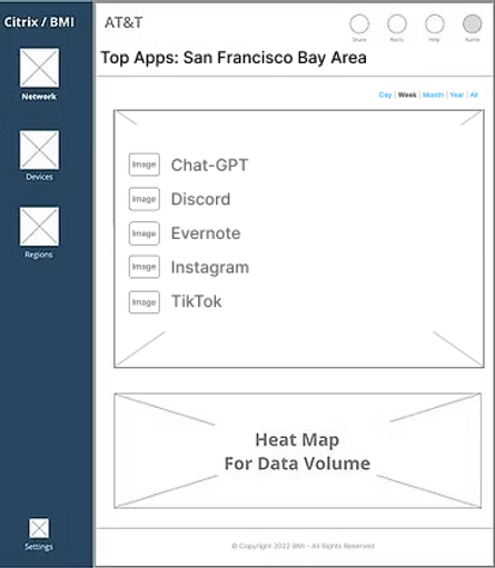


Image: Wireframes of Dashboard
Color Studies
We explored a variety of different layouts. Eventually, we worked on a Light Mode and a Dark Mode for the final product.
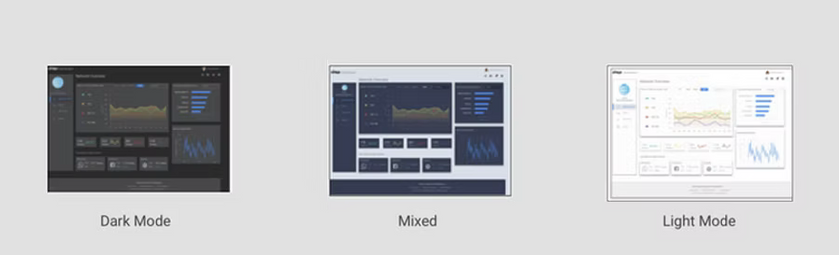
Image: Color Studies for Dashboard
User Testing
Testing and Results
User testing consisted of asking eight subjects to find various KPIs on an interactive Figma mockup. Users were from middle management or C-Suite offices from major telecoms.
They were asked questions like,
"How would you find the total Data Volume for the San Diego Metro Area for February of this year?"
In all, users liked the new ways they could leverage this information.
A dashboard or similar refreshing display, was much more attractive to our subjects.
General testing goals and results are shown below.

User Testing Results


Customer Needs Addressed
Additional Takeaways
-
Users found the designs much easier to navigate than the text file used earlier, (8/8).
-
Dashboard was easier on the eyes than a printout, (8/8).
-
Data Visualization and hierarchy of charts made sense for users, (7/8) .
-
Pleased with ability to chart data in real time (8/8).
Adoption
Following the release of version 1.0, end users were pleased, and our project had a 86% adoption rate.
The original text based file system was phased out of offerings to customers.
Savings
Our Engineers no longer had to manually retrieve data for customers.
This resulted in saving $1.3MM for the company, in our first year of deployment.