
A pregnancy tracker with social networking.

Overview

PregTracker is designed to improve on pregnancy apps like Flo by adding what competitors overlooked: robust communication features and local resources. I'm leading the design of a subscription-free tracker that kept family and friends informed while helping users find nearby gynecologists, hospitals, and classes.
Final Designs

Splash Screen

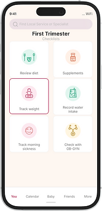
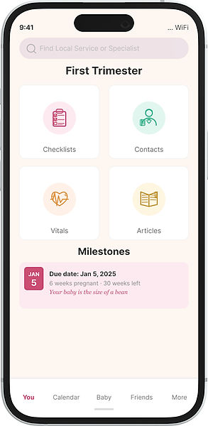
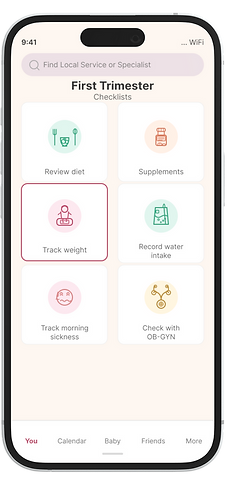
Checklists
Messaging
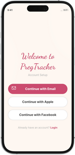
Account Setup

Calendar
Map (Find Resources)
Contextual Landing

Contacts

Inline Advertising
A Deeper Dive
My Roles
-
Product Designer
-
Researcher
-
Visual Designer
Deliverables
-
Wireframes
-
Visual Designs
-
Interactive Prototypes
-
UX Research
Tools
-
Figma

Problems
-
Pregnancy can be a daunting and overwhelming process. How can we take stress out of the journey?
-
How can we organize vast amounts of information and scheduling into an easy to digest experience?
-
How can we notify family and friends about milestones during preganancy?
-
How can we make finding specialists easier?

Solutions
-
Provide day-by-day guidance with context-sensitive tips and articles that adapt across trimesters, plus health stat tracking.
-
Notify friends and family of key milestones via text messaging (similar to Uber's status updates).
-
Help users find and book nearby specialists, facilities, and classes in 1-2 taps, with insurance coverage verification and opt-in.
Visual Design
Flow Diagrams
Before mocking up PregTracker, I worked on the information architecture for the app. This helped the Dev team not only see the number of screens expected, but also how data would flow.
Image: Flow Diagrams
Preliminary Sketches

Image: Early Sketches
Wireframes
Created in Figma, this diagram shows maps microinteractions to screens in the app.
Image: Wiresframes
Interaction Designs

Messaging
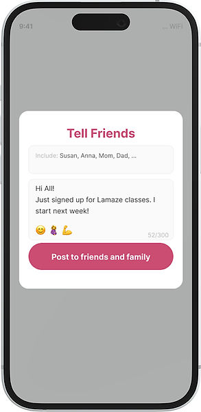
While most pregnancy trackers had message boards, they didn't take advantage of the immediacy of messaging. I started out trying to mock up what a messaging session might look like.
Here we see a messaging page from within PregTracker. It includes a list of people to get the message. Users can select from either family or friends, as some announcements may be more personal than others.


Image: Messaging UI in App

Image: Recipients see messages in their inbox.

Find a Specialist
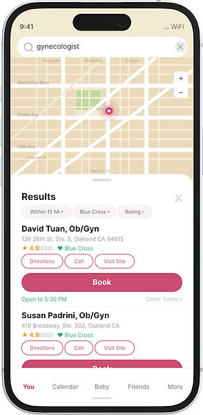
Most pregnancy apps provide health tracking and articles but don't help users take action. PregTracker hopes to bridge this gap by connecting users to specialists, classes, stores, and facilities based on their needs and location.
After entering their address during setup, users can search for providers within 10, 25, or 50 miles, filter by patient ratings and insurance plans, then book appointments or call directly - all in a few taps.

Image: Locator Map

Image: Additional Map Filters

No Subscription Fees - Using Ads
While a subscription model is standard in the field, Business wanted to attract users by not charging for use.
Several ideas were discussed including: "Try before you buy." After running some revenue models, the team determined that after the first year or so, in-app ads, could cover overhead.
I was tasked with creating some context sensitive ads and ran through a few iterations. Some were plain text, similar to google Adwords, others were more visual. One version included a pop-up.

Text Based Advert
Screen Design Variations
Screen designs went through several rounds of revision based on user feedback. Designs moved from a green to a pink palate, with larger buttons for easier interactions. Five users found the green treatment too offputting and clinical. They expected something more playful.
Four users found the pink UI to be more user friendly and welcoming.

Green Palate
Pink Palate
User Testing
Methods and Findings
For this first round of testing, we selected six women who were either mothers or newly expectant mothers. All of them had used a smart phone, either iPhone or Android, for at least five years.
Our goal was to test core functionality such as onboarding and conducting a journey through pregancy.
In addition we tested features unique to PregTracker.
Testing was conducted with interactive prototypes and focused on some basic goals.


Acting on Data
Find Service Maps:
I would work to improve the vertical spacing on cards on the maps screen, to reduce density, give the text room to breathe and make items in the card easier for users to pick out at a glance.
Advertising:
While I would emphasize visual ads, we should test all three for a few months to determine empirically which ad design has the best click through rate. From there we can choose the winning ad design for our revenue strategy.
Next Steps
We came to the PregTracker project with the hopes of meeting a few needs that our team found lacking in the pregnancy app space. There are still a lot of rough edges we'd like to refine for subsequent releases.

Maps
The locator map fills a critical gap in pregnancy apps. We integrated maps with insurance and language filters, though additional research is needed to identify other desired features.
While users found the map intuitive, it was built rapidly and doesn't match the app's visual style. Better integration would create a more polished, cohesive experience.
Messaging
The messaging feature was designed for high contrast, to be easy to read. I'll spend more time however, skinning the container with colors the better match the app's overall pink palate and Lottie animation style.
Ad-Tech
Analytics on our ads support the hypothesis that the visual ads that are part of the page's feed work the best.
